CASE STUDY
A podium placed identity for a cycling trust
Cyclopark
Cyclopark is a world-class cycling venue in Dartford, Kent. The Cyclopark team wanted to expand the range activities they provided the local community beyond just cycling. This included providing more fitness facilities and introducing family friendly activities. I was asked to evolve their existing brand identity into something which had a broader appeal and would encourage a wider group of people to consider using Cyclopark as place to cycle but also keep fit and have a fun family day out.
Services
- Logo design
- Brand guidelines
- Graphic design
- Creative direction
The problem
Cyclopark was expanding their reach beyond the local cycling community and needed a new visual identity to reflect their future ambition.
The mission
The management team wanted to update the visual identity of Cyclopark to reflect the future ambition of the trust. The identity would need to be flexible and accommodate a range of new products the park were to offer.
The outcome
A new cohesive identity was created allowing for a descriptor to sit alongside the logo that explained what the park offers. I also created some visual guidelines for the internal team to use as well as designing sub branded logos for specific services. I also provide ongoing creative support for campaigns.
The impact
Since the new visual identity was implemented and on-going creative Cyclopark have enjoyed an increase in memberships sign-ups and an increase in people visiting the park.
Visual identity
Designing a new logo and identity for an ambitious client.
The logo
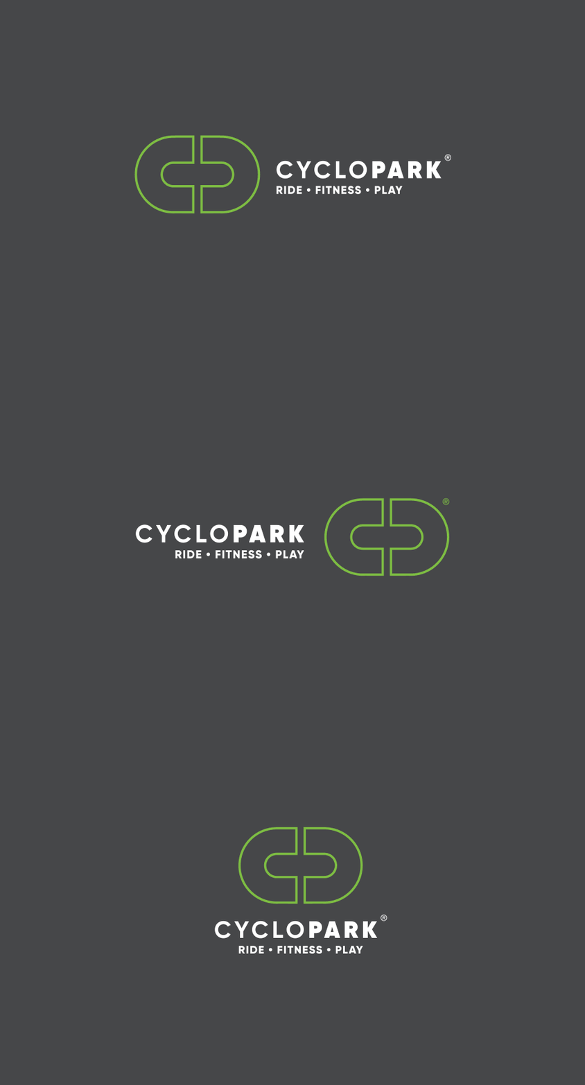
The existing logo was heavily cycling focussed and needed to inject more confidence. Here’s some notes of the key considerations when re-designing the logo:
- Adding in descriptors to easier explain what the park does within a logo. Ride, Fitness, Play.
- Simplifying the overall logo – making it more scalable and accessible.
- Sharpening the font in the logotype – reflecting the changing and expanding products the organisation provides.
- Using uppercase within logotype keeps things neater in print and digital applications.
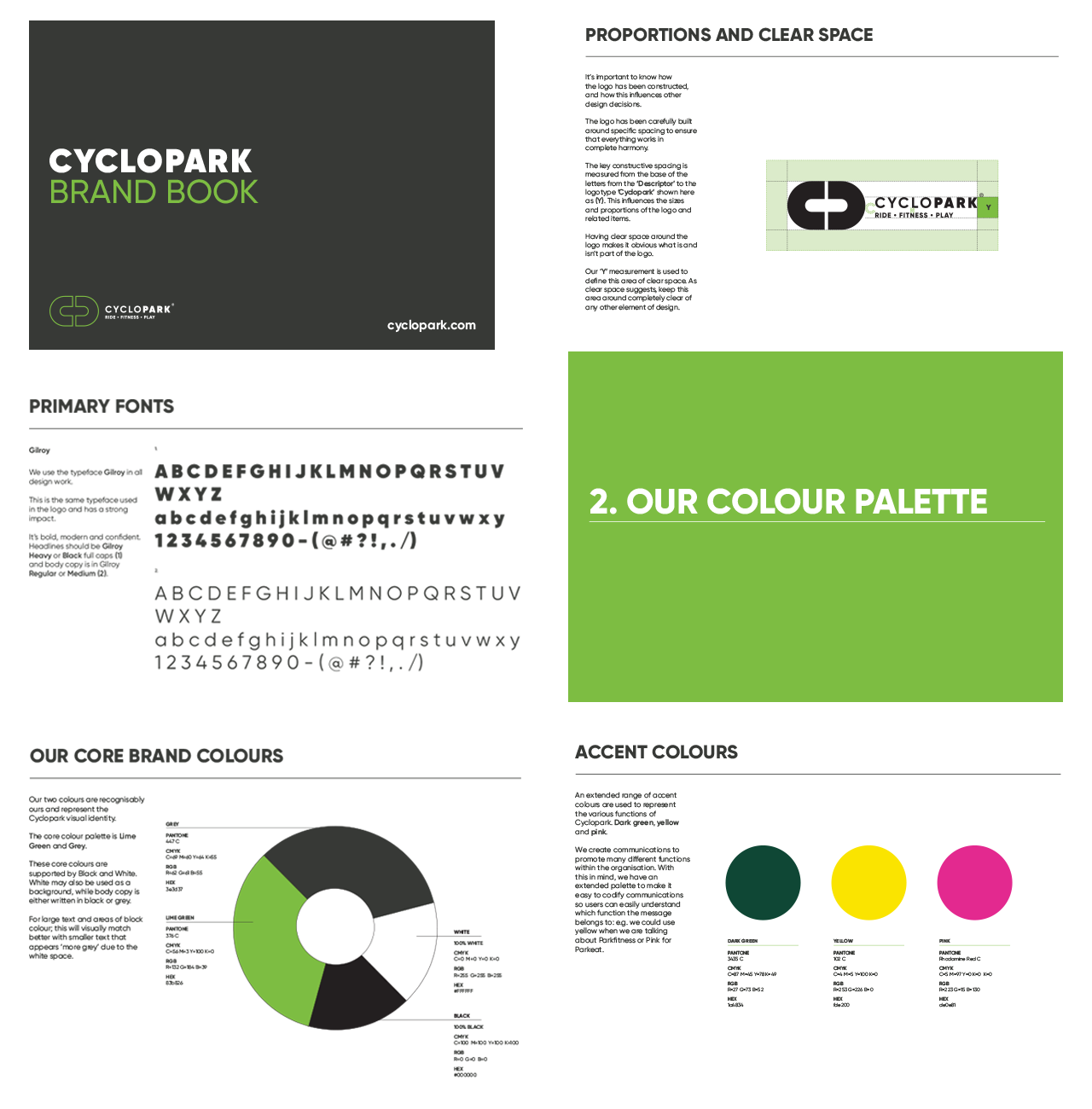
- Muting the colour palette to two colours – dark grey and lime. This will help Cyclopark to own more brand recognition locally and over time become instantly recognisable.
- Creation of two variations of the logo – portrait and landscape allowing greater flexibility for the logo to be used across different platforms.
Brand guidelines
The next job was to create a set of simple guidelines needed to help the internal team, freelancers and agencies create assets without confusion. They were kept relatively basic but covered some core principles like logo do’s and don’t, colour palette, fonts and some examples. Having some guidelines ensures all marketing of Cyclopark in print and digital could be consistent, clear and easy to follow.
Creating a Easter campaign
Bringing everything together to create a focussed campaign.
Creative direction
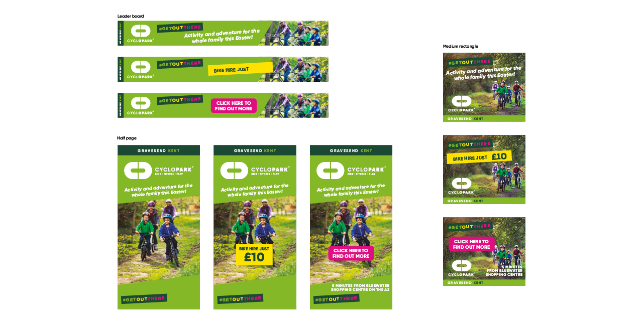
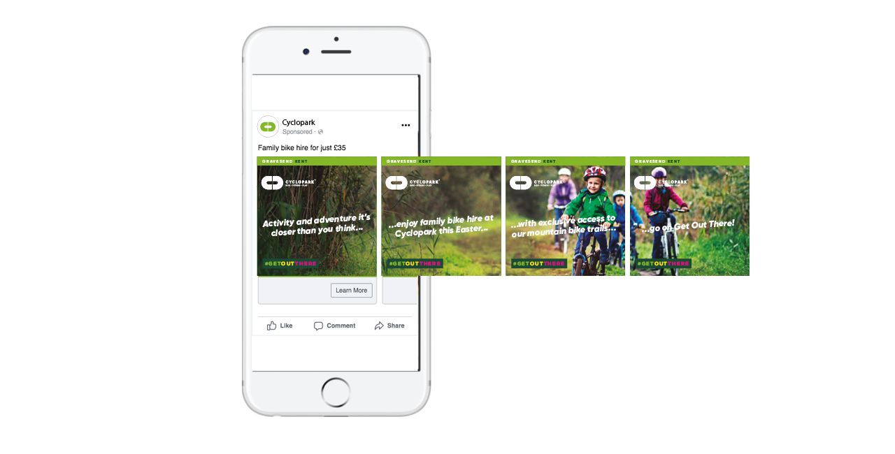
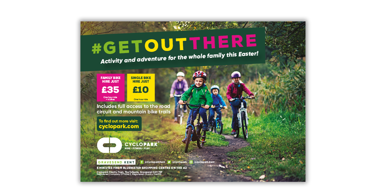
With more activities now available at Cyclopark, the team asked me to continue to work with them to offer creative direction on a number of campaigns including this Easter campaign (Above). The aim of the campaign was to encourage families to use their bike hire service and off-road tracks. Using the headline ‘Get Out There’ it was a real call to action for families to get off the couch and explore activities on their own doorstep. I created a whole series of display motion ads, Facebook carousel, and print ads. The design was bright, energic and for the whole family.
In print
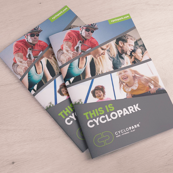
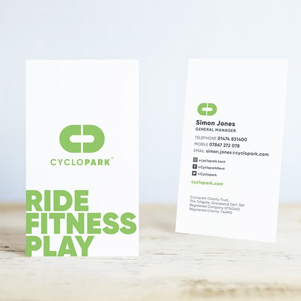
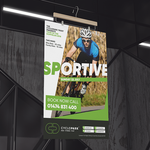
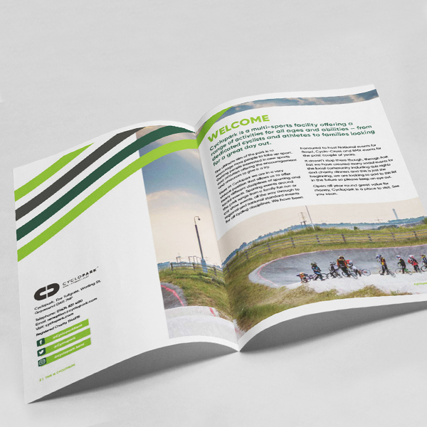
It’s still nice to hold something, sometimes – guides, leaflets and promo materials.
Graphic design at your service
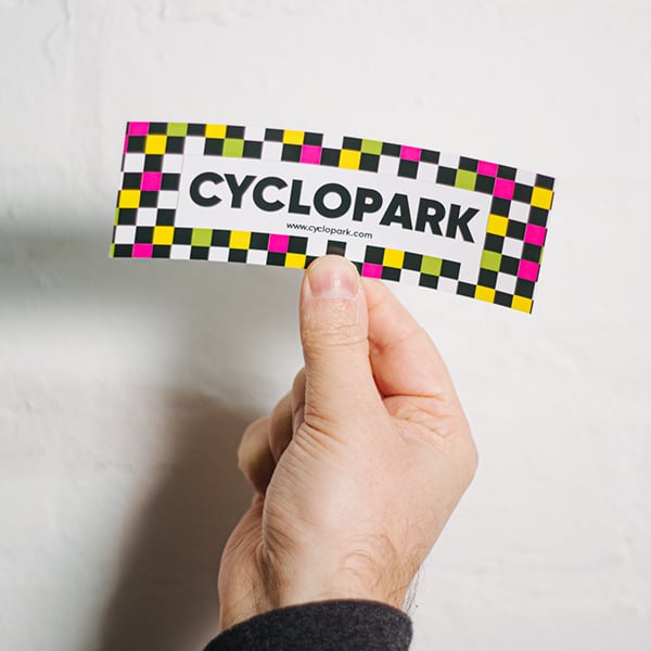
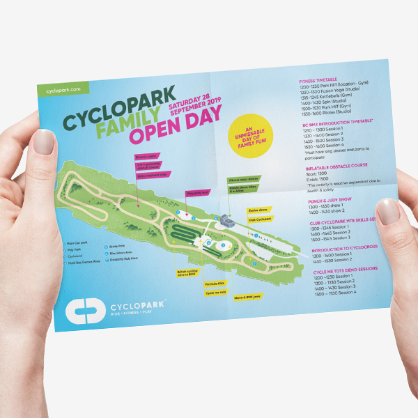
I continue to work with the internal team to advise and design a look at their marketing collateral. Above are some examples of the type of work I have created over the past couple of years. I am able to push the creative design a little but always have the core guidelines to use as a strong starting foundation. I am particularly proud of the stickers I created for members to use to show their affiliation with the park. They were featured on ‘Awesome Merch’ Instagram feed.
Sub identities
New services needed a new look with a nod towards the master identity!
ParkEat
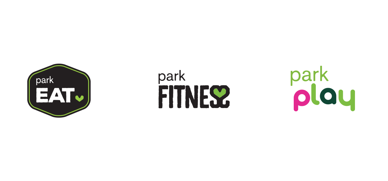
The logo for the on-site cafe needed to be multi-functionally and have the ability to work on signage, menus, coffee cups. The solution was to create a strong badge like design that could be stamped and printed easily.
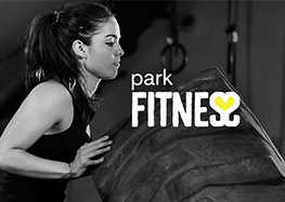
ParkFitness
The in-house gym has become a great addition to the portfolio of products Cyclopark has to offer members. A multi functional gym and full timetable of class needed a logo to resonate with a different audience and appeal regular gym goers. The heart device combining the ‘S’s’ has a duel meaning for health benefits of exercise but also the community aspect of the gym has fostered.
ParkPlay
Another addition to Cyclopark is an increase in the activities for children and families. This includes playground activities, family cycling sessions and bike hire Under the name ‘ParkPlay’ the wordmark I created is playful and clear and uses the master colour to bring it nicely into the overall umbrella of sub-brands.
HAPPY CLIENT
“We have worked with Nick for several years, when we need help to bring a new project or service to life we know we can rely on him to deliver something unique. We have asked him to create visual identities, improve our marketing design and add creativity to our campaigns. His work has helped us improve our marketing, simplify our messages and add something special.”
Simon Jones, Cyclopark General manager

